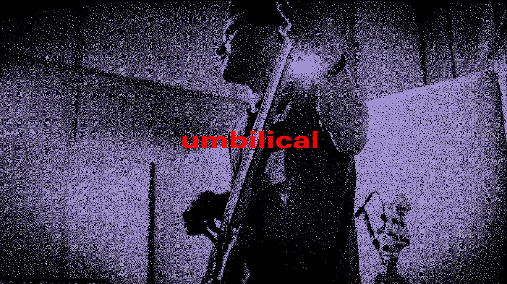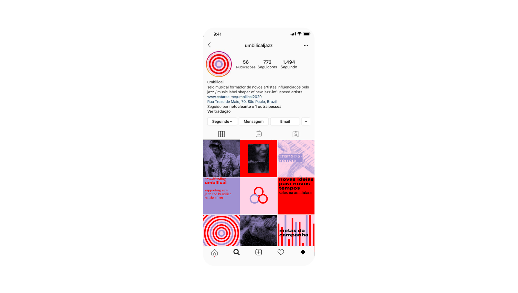
focused on many jazz strands, umbilical comes to shape and release new artists, making structure and resources possible for high quality music production. The objective of umbilical’s visual identity was to develop a consolidated language between every album release by the label, creating a recognisable visual unity, just like many great labels did (Elenco, Blue Note, Columbia, ECM, Atlantic and others).
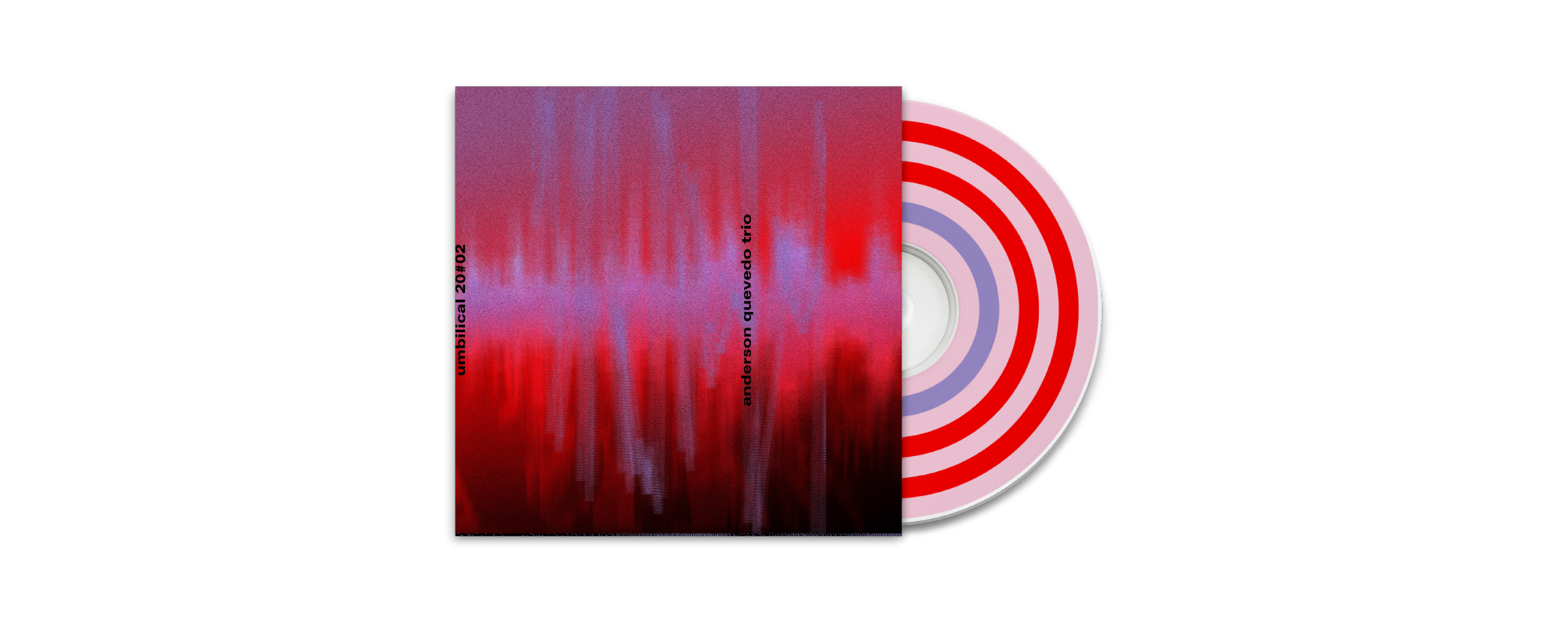
Starting from the concept of an umbilical cord, which contains two arteries and one vein, the visual identity unfolds in the sequence of three circles, two red and one lilac, together with two other colors: pink and black.
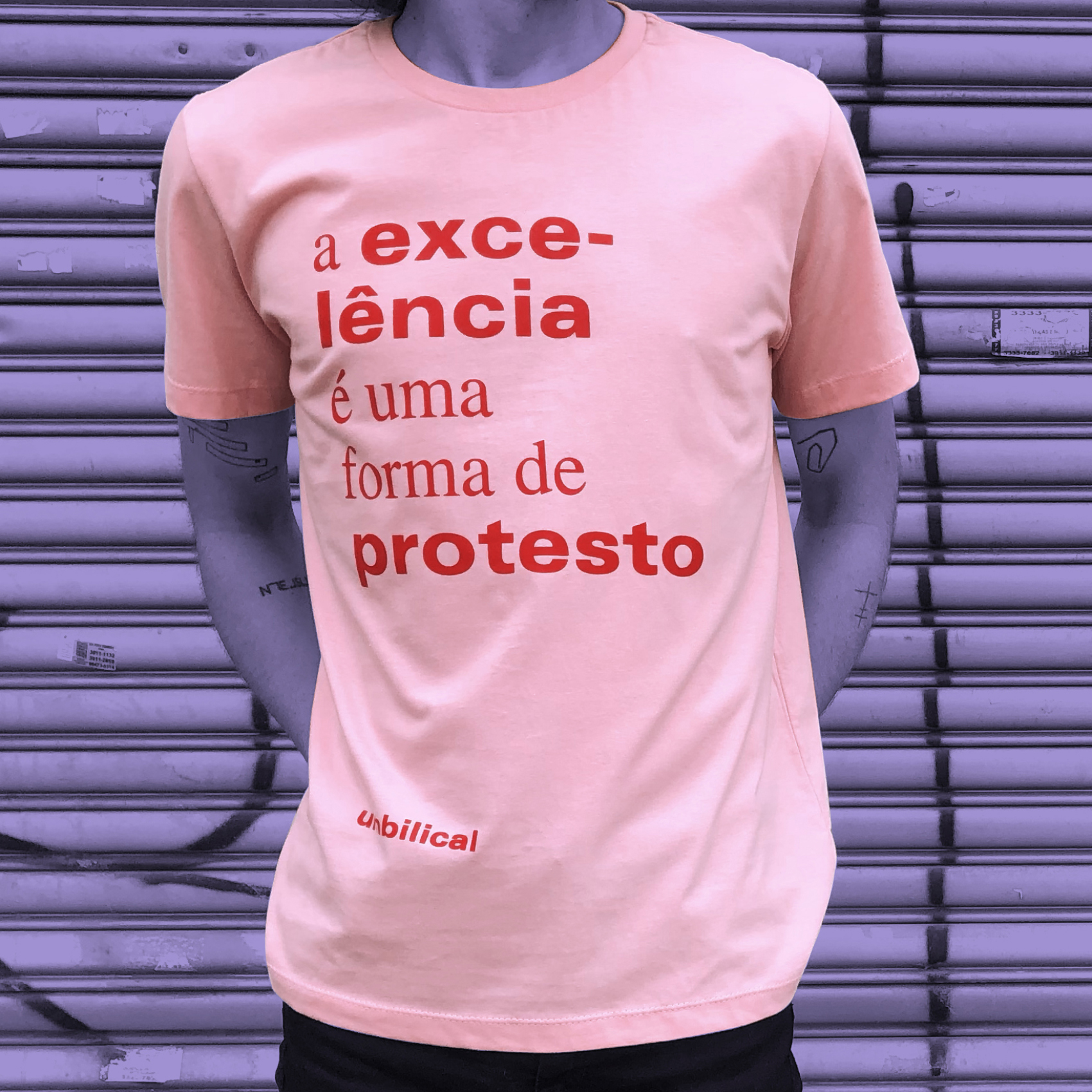
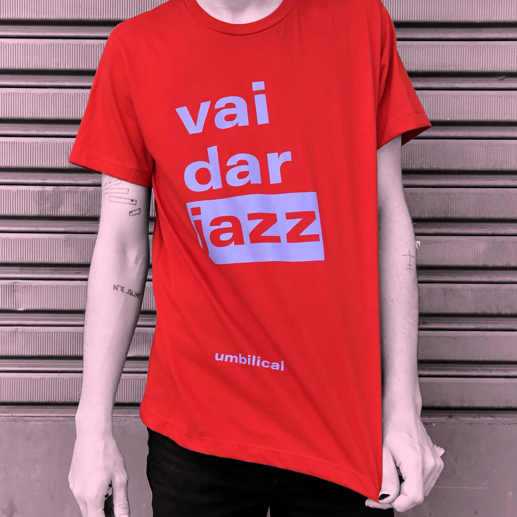
The organic and vibrant colors and the circular shapes create immense possibilities that are explored in every graphic material from the label (videos, social media, album covers, merchandising and more), relating directly to umbilical, even when the label’s name is not there. The typographic selection sought to bring two different fonts, in order to create interesting compositions and distinguish titles, subtitles and texts: a sans-serif, bold and extended font as opposed to a serif, light weight and with contrasted strokes.




Vitor Arantes
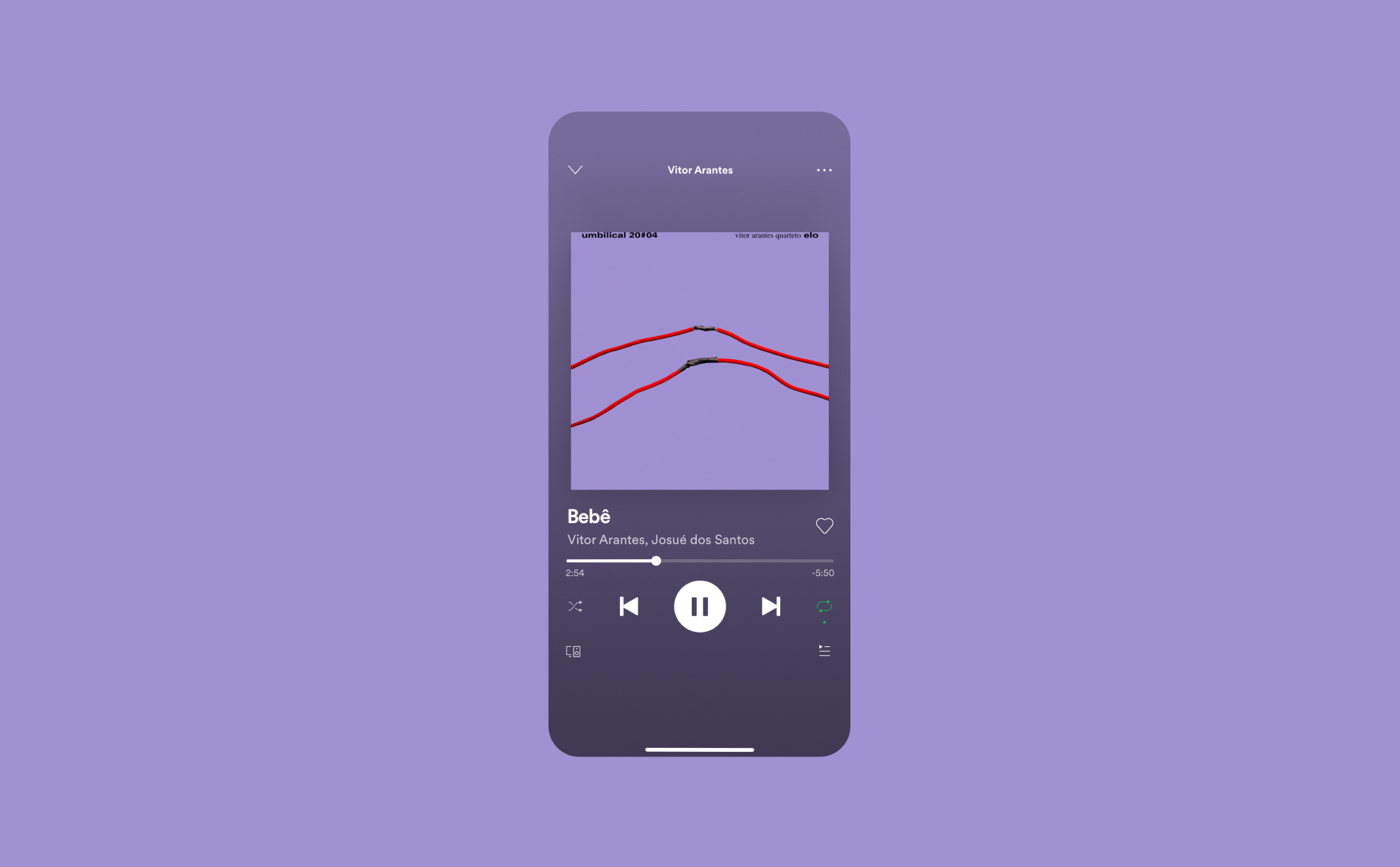
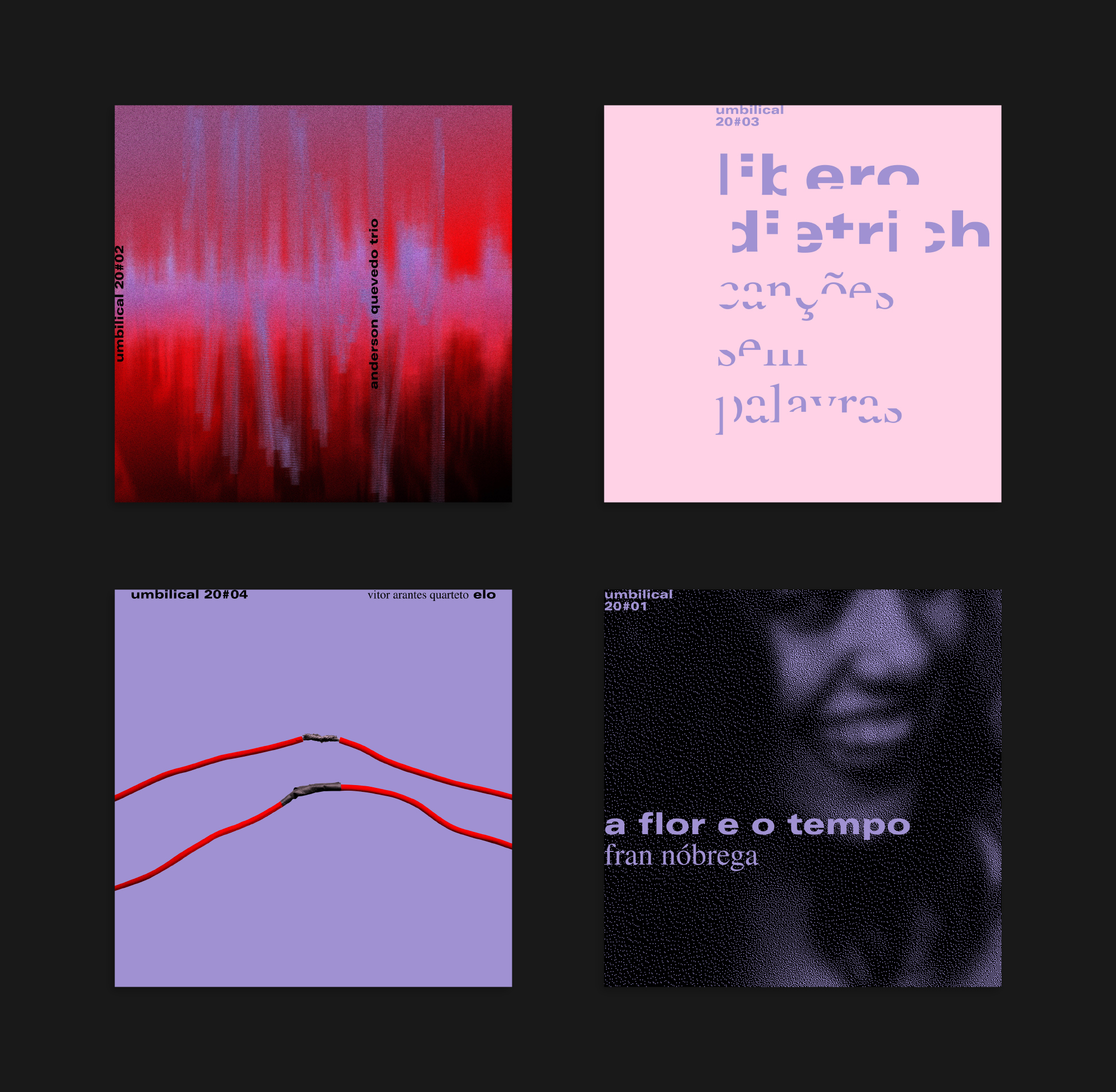
For the cover of "Elo", by Vitor Arantes Quarteto, I decided to picture the connection between different music origins (which gave name to the album) using photography and materials that were at hand during the lockdown. The four wires, representing the band members, are connected in an improvised and transgressive way, bringing the Brazilian language, which is also a reference to the group’s creations. The solid background highlights the object and how simple improvisation is, which is also so natural in our surroundings.
Anderson Quevedo
Inspired by ECM covers, that are also visual references to Anderson Quevedo, I have used aerial photos of São Paulo in the background, making them blurred to give an abstract aspect. Organically, a sound wave overlaps the photograph, bringing reference to the long exposure photos that represent so well the city’s speed and chaos.
Libero Dietrich
For "Canções sem Palavras" (Wordless songs), I decided to use words as non-words: some parts of the letters were removed, transforming them in singular shapes, losing the concept of written word as we know it, but still making them understandable. Libero’s works are dedicated to people close to him, and that affection is represented with the light colors present on the cover of his album.
Fran Nóbrega
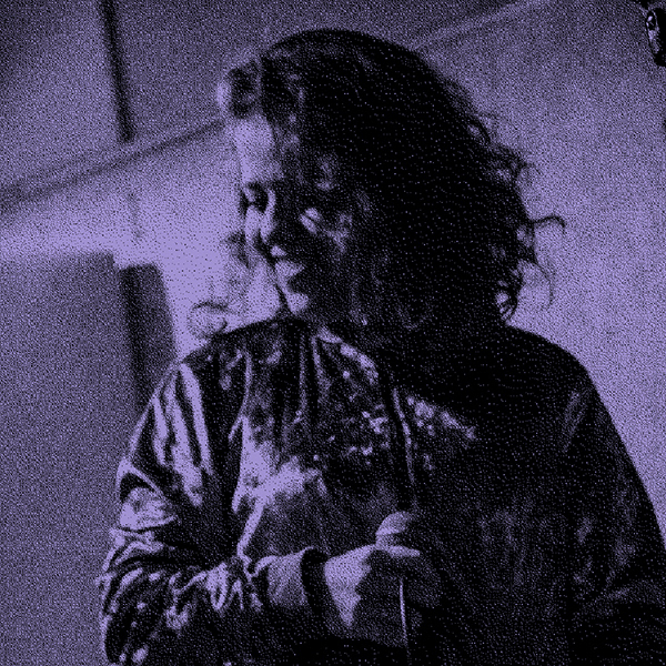
For the album "A Flor e o Tempo" (The Flower and the Time), by Fran Nóbrega, named after the song written by her father, I decided to use the image of the artist herself, unlike the other albums that are also released by umbilical. The highlighted smile and the overlapping typography form a simple and elegant cover, connecting to the artist's music references, which vary between MPB and contemporary music.
